What is your concentration idea?
My concentration idea is to creatively morph and manipulate different human faces. I can use many different themes and inspirational topics for each piece. I wan to use twelve paintings in my concentration using acrylic medium and experiment using texture gel medium, and different color techniques such as: metallic paint, b&w, sepia, focal b&w, color compliments, etc. I will tend towards a more pop art feel and each painting will not just be a boring face in the middle of the canvas, but will utilize different parts of the face and different angles, even cropping effects. I may perhaps expand my concentration to encompass not only the face but the entire human body.
How will the work in your concentration demonstrate your idea?
My concentration will demonstrate this idea through each face/body. The way each face is used design-wise will speak for itself, since this idea is somewhat shallow until each centered theme for the piece is developed.
Monday, November 12, 2012
Monday, October 22, 2012
The Art of Building and the Nature of the Universe: Essay Summary Assignment
The article focuses on building and its creation of order in the world. The actual, or true definition of order is widely unknown by humans. We have informal opinions on what it means, but do not really understand its value. The author of the text has an interest in making beautiful buildings, contrasting with the "slick", or mundane ones created by others in his architectural field. He does not want to give up on the lost art form of 12th-15th century Europe architecture, which others see as too hard and simply dismiss.
The author is an empirical person, who faces difficulty coming to terms with issues which contradict his theoretical concepts. After much difficulty trying to formulate principles, he is able to construct, "a coherent view of order," which, "deals with the nature of beauty." He succeeds in creating a theory even though it may seem absurd to his 20th century trained colleagues.
Sometimes it is difficult even for the author to believe in his theory. He uses the comparison of Saint Teresa and her struggling doubts with faith, to further identify himself with. He states that even though some readers will be very skeptical of the validity of his algorithm, he firmly holds it to be the truth. The author also shares of his moments at the film premiere and of the cheering and clapping he received from the audience. He did not understand it at first, but later realized it was them agreeing with him that shared human feeling has been forgotten. Even though we acknowledge that we are different from one another, we are also very similar in nature.
Saturday, October 20, 2012
Art and Fear Quotes
“Artistic temperament
sometimes seems a battleground, a dark angel of destruction and a bright angel
of creativity wrestling.“
-Madeleine L'Engle
“Very few people possess
true artistic ability. It is therefore both unseemly and unproductive to
irritate the situation by making an effort. If you have a burning, restless
urge to write or paint, simply eat something sweet and the feeling will pass.“
-Fran Lebowitz
“I believe people may have a
predisposition for artistic creativity. It doesn't mean they're going to make
it. “
-Rita Dove
“My personal life and my
artistic life do not interfere with each other.”
-Stephen Sondheim
“Artists usually don't make
all that much money, and they often keep their artistic hobby despite the money
rather than due to it.“
-Linus Torvalds
Week 8 Photo Assignment
Note: All pictures have been taken by me. Do NOT steal.
Best Pictures:


 I chose this image, because I love the way the light flows at an angle into the frame, making it appear almost heaven-sent. I chose to shoot this image while I was out in my grandmother's garden this summer, after adoring the tall flowers and entanglement of stems and tree branches. I believe this picture has a lot of depth, with the many layers of vegetation. The balance of this image makes it very powerful and just stunning overall.
 I chose this picture because of the great contrast and the whimsical, reminiscent feelings of childhood I get when viewing it. I chose to take this picture while babysitting friend's child one day. I think it has spatial depth, due to the dark background, which pushes the young boy, to the front of the picture. I cropped this image to showcase the playful, yet serious nature of this funny little fella. I think the balance helps the image focus on the expression of the young boy.
 I chose this picture, because I love the way the light highlights my friend Julia's hair, and the blurred background. I took this the day before one of my best friend's moved and we all decided to walk around my neighborhood and take pictures. I had my friend smile off into the distance, and thus this picture was born. To crop this picture I thought for the optimum effect I would need to take it from shoulder height up. I think it is spatially deep with the houses in the background. The balance gives a feeling of completeness to the image.
 I selected this picture because of the way I cropped it to focus on the word "focus" and blur out most of the background. I took this the same day I shot the picture of the perfume bottles, experimenting with everyday objects. I think it is spatially deep with the magazine in the background, and that the balance allows the viewer to focus in on the bottle and the little pun.
Weakest Images
 I think this image is weak because there is one object in the center of the frame, with little composition. I took this while experimenting with everyday objects cause I was intrigued by the faux diamonds on the necklace. I didn't really pay much attention to cropping when I took this picture, which I believe is why it is so bad and uninteresting. I also believe it to be spatially shallow, but it does have balance.
 I think this image is weak, because it is repetitive and boring. The only thing I like is the perspective which makes the fonts appear bigger and smaller, as an illusion. I cropped it to highlight these words on the binding. I think this picture is spatially deep due to the left hand corner, showing the magazines go back into the shelf. I do think the balance adds to the repetition.
Best Pictures:

I selected this image because I love the sharp and clean contrast and its focus on the word "love spell." It makes me just fall in love with the picture right away. While taking this picture I cropped around the other bottles partially, so that the focus remained on the center perfume bottle. I shot this picture because I wanted to experiment with taking pictures of everyday objects I use, and take them to another level. I think spatially, it is in the middle. The cylindrical objects have depth, as the sides of the bottles are pushed back, but there isn't too much depth to where it is overwhelming. I think my use of three objects adds to the balance, because if I only used two, I would feel the composition to be incomplete.

I selected this image, because I love the vintage vibe, from its location in Hot Springs Arkansas. I shot this image while walking around their one weekend, during Summer vacation. The illustration on the wall, and the intersecting traffic light really make this picture work, and that's why I cropped the image to have the traffic light jut into the frame. I believe this image to be spatially deep, with the wall pushed back, adding perspective. I shot this picture because I absolutely loved the image painted on the side of the brick building. I think the image is really balanced and I am very proud of it.


Weakest Images


Sunday, September 23, 2012
Week Three Responsive Exercise
Week Three Responsive Exercise: SHAPE
.jpg)


1. Aaron Douglas
Mr. Douglass uses the shape of a star in this piece. He also uses shapes in the dark silhouettes of the three people. His shape quality provides great craftsmanship, and gives the piece an abstract feel, where the objects are still recognizable. The overlaying of multiple shapes adds tone.
2. Elizabeth Murray
The artist uses three dimensional shapes and collages them together. The contrasting colors and unique outlines on the shapes, featuring many curves gives a playful vibe, verses a harsh geometric feel if she uses average shapes.
3.Bill Brandt
Mr. Brandt uses shapes in his compositions symbolically. By this I mean he does use obvious shapes, but the clear focal points of the legs, create their own shapes within them, anatomically and with shadows. The windows add a bit of a geometric perspective, but since they are not the focus, they do not steal attention away from the legs.
4. M.C Escher
He uses shapes in the spheres and in the "ribbon-like" lines, which wrap around each other, to create the illusion of the human head. They give a 3D vibe to this 2D piece.
5. David McNutt
He uses creates unique silhouettes with positive and negative space. It give the appearance of a shape within another shape and is really visually fascinating.
6. Robert Rauschenburg
.
He uses a unique approach to shape quality, by sectioning off and painting rectangular spaces, or adding on additional rectangles and squares to this mixed media, architectural piece.
7.Helen Frankenthaler
She uses an originally designed shape, and fills it with different tones of blue, to give the appearance of multiple shapes within in. The green background creates another shape as it contrasts with the edges of the blue one.
8.Wassily Kandinsky
He uses a very defining, geometric shape quality. Not only does he use shapes but he also adds interest with simple black lines which intersect shapes and other lines.
9. Ansel Adams
In his photograph, Adams uses shape through the spherical boulders and square/triangular pyramid shaped mountains. The angle of the clouds filling in the valley between the mountains, adds definition to their slopes.
10. Robert Moskowitz
Moskowitz's piece uses a very simplified shape. His only objects in the entire composition are the tree trunks and branches, which appear flat with no extra gradation. They frame the white, background space.
11.Charles Demuth
Demuth creates shapes with architectural lines and shade variations within the buildings. The buildings already have a shapely contour to begin with, which adds to the shape quality. Overall it is very refined.
12. Sidney Goodman
Goodman does not have a distinctive shape quality. He appears only to semi-create anatomical shapes with the shading of the charcoal. The piece is excellent overall, but I cannot see any stark use of shape.
13.Romare Beardon
Beardon uses shapes all over this piece. You cannot look in one spot without seeing another shape. There is semi shading within these shapes, but overall they maintain a flat, cartoon look.
14. Jasper Johns
This pieces's use of shapes is pretty obvious and straightforward. It is the American flag and the shapes of the flag are repeated and appear as they always have.
Tuesday, September 11, 2012
Week 1 Responsive Exercise


1: Line Quality-
Both of these have very related, excellent line qualities. They both have a similar shape canvas/paper and both of the figures are lying at similar angles. In each picture the deceased has their right hand over their body and the left is outstretched. It leads the viewers' eyes to the head first, and carries them along the arm to the object on the far left. The line quality gives both works great fluency and the direction and angle/perspective of the bodies makes it appear as if they have both just fallen down and have landed in that position.

2: Actual Lines: The Cocktail Party has a dominant orientation of vertical lines. Both figures are standing tall, upright, and the same goes the the chairs and table. Horizontal lines are present through the horizon and along the top of the mountains in the distance. When the lines intersect, (ex: the mountains and the man's arm) the viewers eye is drawn to that point.

3: Framework: In this piece the artist is using very dark shadows to act not only as contrast, but to contour the bodies of the people. It really draws your attention to what is occurring in the painting. If he had used a detailed background, attention might be stolen away from the true focal point.
4: Expression:
I'm kind of split on my views towards this series of paintings. I think the overall idea is genius, but I'm not a fan of the coloring of the works. I feel like he should have used a darker, more cool palette in this piece and save the warm hues for the happier piece only (before the accident/death). I also don't understand the piece regarding the accident. Why are people in the water, jumping out the prevent it? I was just confused as the who got injured, if none of them were already in the car?
Week Two-Responsive Exercise
The Artist of these works go in the order of the following list:
- Alberto Giacometti
- Walt Disney Mickey Mouse Action Sketches
- Barnett Newman
- Wu Guanzhong
- Tawaraya Sotatsu
- David Mach
- Michelangelo
- Jackson Pollock

This sculptural piece, creates a beautiful, simplified silhouette of the human body. Even though it is a sculpture of the full human, if you take away the thickness of the head and feet it looks like a mere line that branches out at the bottom.

Walt Disney uses excellent contour lines in this basic cartoon. The nature of its modest simplicity is rather quite admirable.

This piece represents the line really well, given the fact that it is composed of just two lines and a large portion of black space in the background.

This piece I really like. The stacking of the contour lines, gives the illusion of broad tree trunks. And the hatching lines add a nice, artistic touch.
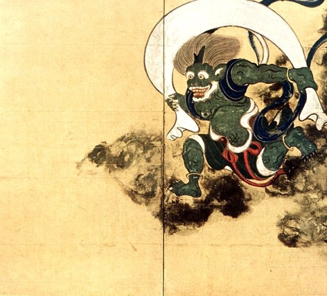
This piece involves many calligraphic lines, prominent in Asian art. The lines create the contour of the muscles and outline of the creature's body.

In this sculpture, the artist creates three-dimensional lines, which jut out from the head. They are curved on the end, but remain to look as if they stick out straight.
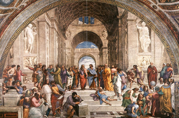
This painting by Michelangelo demonstrates a great use of linear perspective. The perspective of the columns, create the implied lines which stretch along the side of the wall, originating in the back of the building.

This splattered/textured painting has many curved lines, which makes up the entire composition. The red splatters which are not developed into full lines act as a nice, vibrant contrast.
Subscribe to:
Comments (Atom)