Sunday, September 23, 2012

Week Three Responsive Exercise

Week Three Responsive Exercise: SHAPE
1. Aaron Douglas
Mr. Douglass uses the shape of a star in this piece. He also uses shapes in the dark silhouettes of the three people. His shape quality provides great craftsmanship, and gives the piece an abstract feel, where the objects are still recognizable. The overlaying of multiple shapes adds tone.  

2. Elizabeth Murray
The artist uses three dimensional shapes and collages them together. The contrasting colors and unique outlines on the shapes, featuring many curves gives a playful vibe, verses a harsh geometric feel if she uses average shapes.

3.Bill Brandt
Mr. Brandt uses shapes in his compositions symbolically. By this I mean he does use obvious shapes, but the clear focal points of the legs, create their own shapes within them, anatomically and with shadows. The windows add a bit of a geometric perspective, but since they are not the focus, they do not steal attention away from the legs. 

4. M.C Escher 
He uses shapes in the spheres and in the "ribbon-like" lines, which wrap around each other, to create the illusion of the human head. They give a 3D vibe to this 2D piece.

5. David McNutt
He uses creates unique silhouettes with positive and negative space. It give the appearance of a shape within another shape and is really visually fascinating.

6. Robert Rauschenburg 
.
He uses a unique approach to shape quality, by sectioning off and painting rectangular spaces, or adding on additional rectangles and squares to this mixed media, architectural piece. 

7.Helen Frankenthaler
She uses an originally designed shape, and fills it with different tones of blue, to give the appearance of multiple shapes within in. The green background creates another shape as it contrasts with the edges of the blue one.

8.Wassily Kandinsky
He uses a very defining, geometric shape quality. Not only does he use shapes but he also adds interest with simple black lines which intersect shapes and other lines.

9. Ansel Adams
In his photograph, Adams uses shape through the spherical boulders and square/triangular pyramid shaped mountains. The angle of the clouds filling in the valley between the mountains, adds definition to their slopes.

10. Robert Moskowitz
Moskowitz's piece uses a very simplified shape. His only objects in the entire composition are the tree trunks and branches, which appear flat with no extra gradation. They frame the white, background space.

11.Charles Demuth
Demuth creates shapes with architectural lines and shade variations within the buildings. The buildings already have a shapely contour to begin with, which adds to the shape quality. Overall it is very refined. 

12. Sidney Goodman

Goodman does not have a distinctive shape quality. He appears only to semi-create anatomical shapes with the shading of the charcoal. The piece is excellent overall, but I cannot see any stark use of shape.
13.Romare Beardon
Beardon uses shapes all over this piece. You cannot look in one spot without seeing another shape. There is semi shading within these shapes, but overall they maintain a flat, cartoon look.

14. Jasper Johns
This pieces's use of shapes is pretty obvious and straightforward. It is the American flag and the shapes of the flag are repeated and appear as they always have. 

Tuesday, September 11, 2012

Week 1 Responsive Exercise


Fred Folsom, Adrift on the Lethe

1: Line Quality-
Both of these have very related, excellent line qualities. They both have a similar shape canvas/paper and both of the figures are lying at similar angles. In each picture the deceased has their right hand over their body and the left is outstretched. It leads the viewers' eyes to the head first, and carries them along the arm to the object on the far left. The line quality gives both works great fluency and the direction and angle/perspective of the bodies makes it appear as if they have both just fallen down and have landed in that position.

2: Actual Lines: The Cocktail Party has a dominant orientation of vertical lines. Both figures are standing tall, upright, and the same goes the the chairs and table. Horizontal lines are present through the horizon  and along the top of the mountains in the distance. When the lines intersect, (ex: the mountains and the man's arm) the viewers eye is drawn to that point.

3: Framework: In this piece the artist is using very dark shadows to act not only as contrast, but to contour the bodies of the people. It really draws your attention to what is occurring in the painting. If he had used a detailed background, attention might be stolen away from the true focal point.
4: Expression:
I'm kind of split on my views towards this series of paintings. I think the overall idea is genius, but I'm not a fan of the coloring of the works. I feel like he should have used a darker, more cool palette in this piece and save the warm hues for the happier piece only (before the accident/death). I also don't understand the piece regarding the accident. Why are people in the water, jumping out the prevent it? I was just confused as the who got injured, if none of them were already in the car?

Week Two-Responsive Exercise


The Artist of these works go in the order of the following list:

  1. Alberto Giacometti 
  2. Walt Disney Mickey Mouse Action Sketches
  3. Barnett Newman
  4. Wu Guanzhong
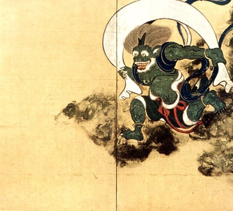
  5. Tawaraya Sotatsu 
  6. David Mach
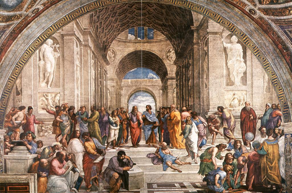
  7. Michelangelo
  8. Jackson Pollock


This sculptural piece, creates a beautiful, simplified silhouette of the human body. Even though it is a sculpture of the full human, if you take away the thickness of the head and feet it looks like a mere line that branches out at the bottom.

Walt Disney uses excellent contour lines in this basic cartoon. The nature of its modest simplicity is rather quite admirable.

This piece represents the line really well, given the fact that it is composed of just two lines and a large portion of black space in the background.


This piece I really like. The stacking of the contour lines, gives the illusion of broad tree trunks. And the hatching lines add a nice, artistic touch.

This piece involves many calligraphic lines, prominent in Asian art. The lines create the contour of the muscles and outline of the creature's body.

In this sculpture, the artist creates three-dimensional lines, which jut out from the head. They are curved on the end, but remain to look as if they stick out straight.

This painting by Michelangelo demonstrates a great use of linear perspective. The perspective of the columns, create the implied lines which stretch along the side of the wall, originating in the back of the building.

This splattered/textured painting has many curved lines, which makes up the entire composition. The red splatters which are not developed into full lines act as a nice, vibrant contrast.